Since the inception of the nationalised railway in the 1960s, British Rail was always at the
forefront of great British design. The British Railways Corporate Design Manual, the APT, the
HST, the InterCity 225, the Double Arrow, and Rail Alphabet are all products of a unique era,
celebrated not just in transport history, but as icons of international design.
The 1990s saw the fracturing of the network, resulting in a varied rainbow of short-lived
Train Operating Company (TOC) identities that came and went. For decades, design choices
stemmed primarily from the projection of corporate interests rather than a cohesive effort to
improve the ease and accessibility of passenger travel.
With the transition to Great British Railways (GBR), we have a unique opportunity to reset the
network’s visual identity, not merely to make the railways look better, but to make them work
better through inherent, functional design.
Unfortunately, the powers that be seem compelled to shout the concept of renationalisation
from the rooftops. Instead of a descriptive visual identity that reflects how a railway operates,
we have been burdened with a prescriptive brand informed by short-term politics and press
releases. The resulting livery fails to exceed the expectations of accessibility legislation, nor
does it invite unity through utility. Instead, the government has been tone-deaf in its execution,
resorting to overt nationalistic symbolism by slapping actual Union flags onto rolling stock.
This lack of coordination extends across every discipline. Network Rail recently introduced
a new wayfinding system for soon-to-be GBR-managed stations: a sterile white canvas
populated by questionable pictograms and black-typeset Rail Alphabet 2 (a revision of the
original 1960s typeface). Yet, less than four years after that mandate was introduced, GBR’s
central brand team introduced the largely more accessible Rail Alphabet 3, but not for our
wayfinding ecosystem.
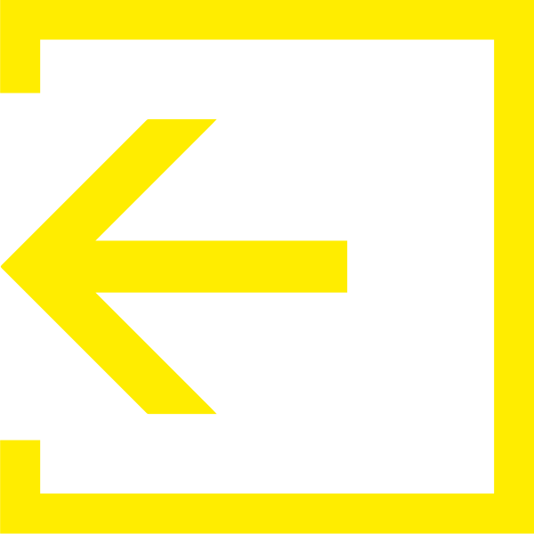
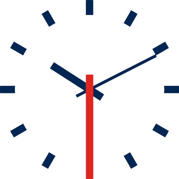
Compounding this is the new “Railway Timepiece”, a pair of counter-rotating arrows formed
from a stylised Rail Symbol 2 surrounding a digital readout. This design is built to impress,
sacrificing function for form. For an industry that pioneered the standardisation of time itself, it
is disappointing to see timekeeping treated with such casual aestheticism.
The Solution
To solve this, we must return to a Total Design philosophy - a systematic framework supported
by three core pillars:
The Logo (Rail Symbol 2): Front and centre is a refined iteration of the original “Double
Arrow”. It has survived 30 years of privatisation and remains one of the world’s greatest
design icons. It should never be a mere appendage to text; its semiotic strength speaks for
itself.
The Colour Palette: Instead of using literal flags, we should selectively employ our national
colours with functional intent rather than clumsy abstraction.
The Typography (Rail Alphabet 3): This proposal calls for the network-wide adoption of Rail
Alphabet 3 across all public-facing touchpoints to forge a truly integrated network.
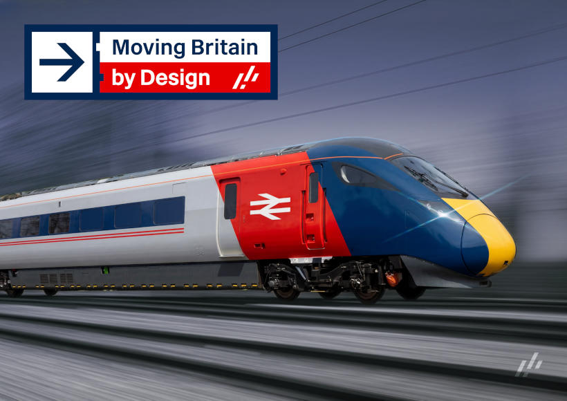
Driven by these fundamentals, the Moving Britain, by Design strategy delivers:
A Refined Pictogram Library: Harmonised across both physical wayfinding and digital
applications to ease the digital-to-platform passenger handover.
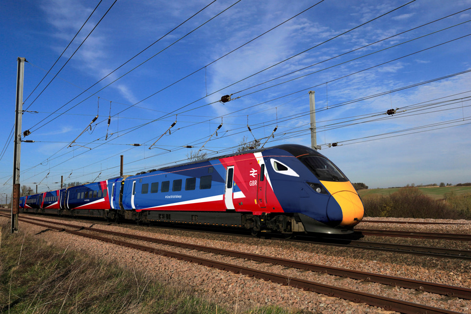
A Tiered Livery Strategy: Utilising distinct liveries for InterCity, Express, and regional
services as a form of macro-wayfinding, enhancing accessibility and setting clear service
expectations.
Rail Timepiece 2: A new, highly legible station clock designed to sit in perfect geometric
harmony with Rail Symbol 2.
To achieve this, the proposal outlines a cost-neutral rollout strategy. By deploying assets
naturally within standard maintenance lifecycles, we protect vital capital expenditure.
This rollout will be overseen by a dedicated Design Governance Board and managed via a
centralised asset portal.
This proposal is not about a nostalgic return to the era of British Rail. Instead, it adopts the
network’s latent identity and advances its legacy in the finest tradition of functional British
industrial design.

.png)